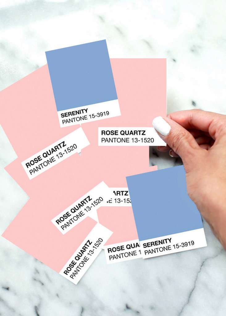
Pantone Color of the Year – 2016
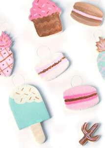
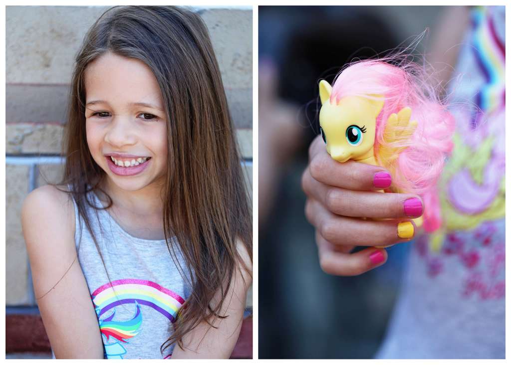
Who else’s eyes filled with hearts after discovering Pantone 2016 Color of the Year? The wheels immediately began turning for me after seeing them the other day! The nominated Rose Quartz and Serenity are a blend of two shades, for a Pantone first, in a rosy pink (squeal) and soft almost sky-like blue. When I look at the two colors together I envision a wintery sunset or sweet french macarons. The pastel hues are a much softer selection than previous years and they represent equality as it relates to the gender blur currently being experienced in fashion. I anticipate seeing both Pantone Rose Quartz & Serenity trending in home decors, weddings, fashion and design this coming year and I personally can’t wait to incorporate both into my creative projects, posts and products.
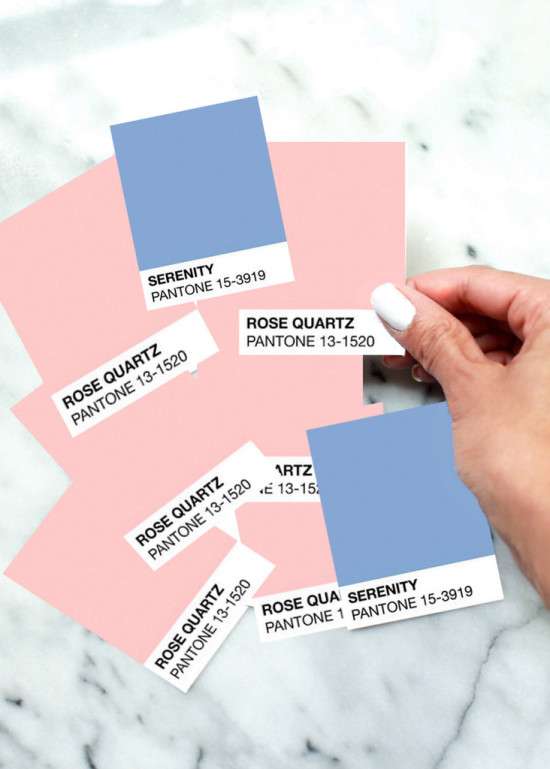
I noticed right away that Rose Quartz matches my new logo almost perfectly! Be prepared to see much more of this beautiful hue from me in the days and weeks ahead!
Enjoy your weekend!
xo
This post titled Pantone Color of the Year 2016 was seen first on Posh Little Designs. All Rights Reserved. 2012-2015.
All Images are photographed and owned property of Posh Little Designs. All Rights Reserved 2015.